Blog eCreative

A Reflection of our Quality work, Excellent Support and Technical Prowess

Websites

PHP 7 – turbocharging the WEB

The most easily recognizable advantage of the new PHP 7 engine is the significant performance improvement.
Performance is undoubtedly the biggest reason why you should upgrade your servers as soon as a stable version is released. The core refactoring introduced by the phpng RFC makes PHP 7 as fast as HHVM.

See the results below, they are pretty self-explanatory – PHP 7 Twice The Speed.

php7

why use php 7

Pocket

11 must-have jQuery plugins

jquery-logo

1. Nprogress

Nprogress is a nanoscopic progress bar. Featuring realistic trickle animations to convince your users that something is happening!
Nprogress.js

2. FancyInput

FancyInput is a jQuery plugin which basically makes it fun to type text. It works with input fields wrapped with a div, in a way that hides the actual input field (but still “communicates” with it), and put a span element containing the character pressed (in a normal use case), and every span element is being transitioned in a nice CSS3 way. The end result is a mimicked text input field which tries to simulate a real input field as much as possible, including copy, paste, undo and text selection changes.
Fancy Input

3. SuperScrolloRama

SuperScrolloRama is a jQuery plugin for supercool scroll animation
Super Scrollorama

4. Signature Pad

Signature Pad is a jQuery plugin that takes advantage of HTML5 canvas element and javascript to create a flexible and smooth Signature Pad on your web page & app. The plugin also has the ability to record the drawn signature in JSON for later regeneration. Be aware that the jquery plugin also requires Numeric Javascript library and bezier curve helper included.
Signature pad

5. Toolbar

Toolbar allows you to quickly create tooltip style toolbars for use in web applications and websites. The toolbar is easily customisable using the twitter bootstrap icons and provides flexability around the toolbars display and number of icons.
Toolbar.js

6. jQuery Pin

jQuery Pin will “pin” any element to the top of a container as you scroll down the page. It can be easily disabled for smaller screen-sizes.
jQurey Pin

7. Chardin JS

Chardin JS is a jQuery plugin to simple overlay instructions for your apps.
Chardin.js

8. Mapael

Mapael is a jQuery plugin based on raphael.js that allows you to display dynamic vector maps.
Mapael

9. jQuery Collage Plus

jQuery Collage Plus will arrange your images to fit exactly within a container. You can define the padding between images, give the images css borders and define a target row height.
jQuery Collage Plus

10. SnapSVG

SnapSVG is a brand new JavaScript library for working with SVG. Snap provides web developers with a clean, streamlined, intuitive, and powerful API for animating and manipulating both existing SVG content, and SVG content generated with Snap.
Snap SVG

11. Typehead.js

Typehead.js is a fast and fully-featured autocomplete library
Typehead.js

Pocket

11 must-have plugins for extending Twitter Bootstrap

Twitter Bootstrap is one of our favourite framework for quick website prototyping. If you don’t know about Twitter Bootstrap, it’s simple and flexible HTML, CSS, and Javascript for popular user interface components and interactions. Originally created by a designer and a developer at Twitter, Bootstrap has become one of the most popular front-end frameworks and open source projects in the world. This great tool contains base CSS, grid, responsive, general styling, UI components and javascript plugins that can speed up your development process.

Twitter Bootstrap comes with many javascript plugins too but some common javascript plugins are missing.
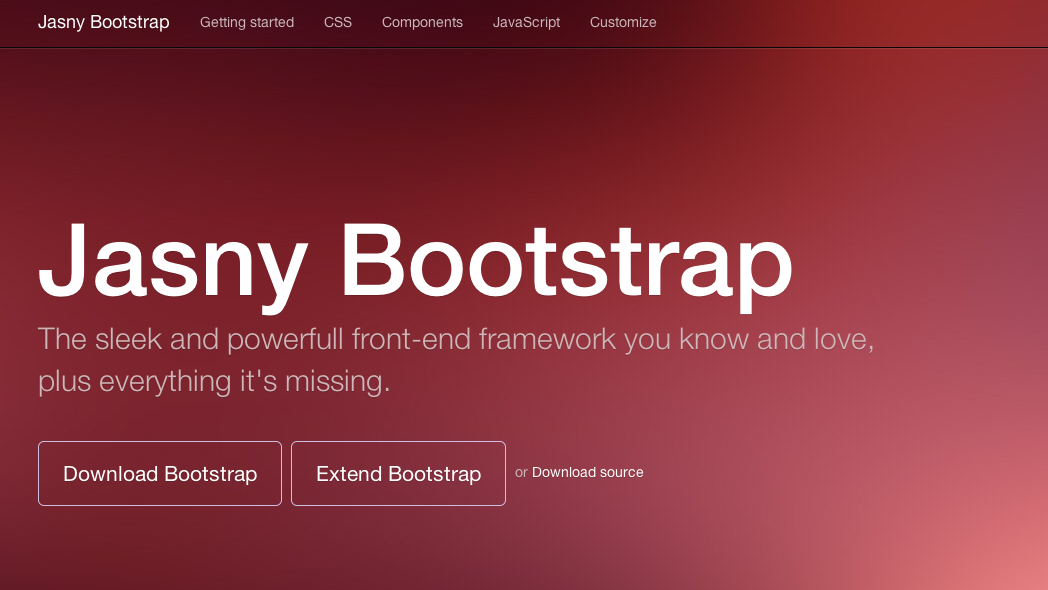
1. Jasny Bootstrap

Jasny Bootstrap is a direct fork of Twitter Bootstrap with a number of additional components. It features controls like input masks, file upload buttons, icons, additional form styles and more.
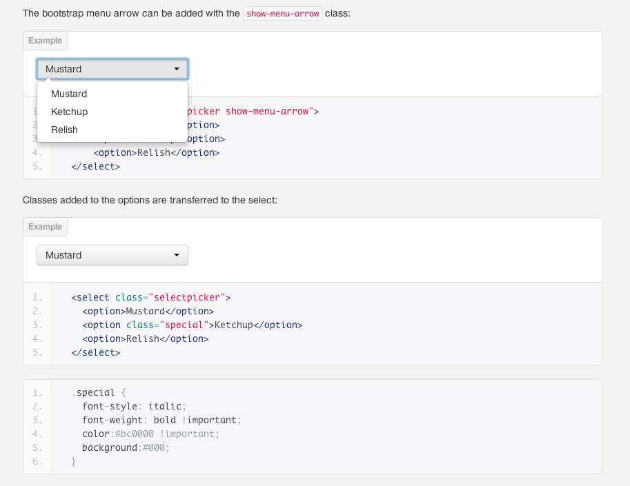
jasny bootstrap

2. Bootstrap Select

Bootstrap favors native browser controls, which is the reason it doesn’t expose any customization options for them. However, in some projects it is useful to have customizable controls like select boxes, which is exactly what Bootstrap Select does. This plugin gives you a pretty and customizable select box which looks great in your page.

bootsatrp-select

3. Bootstrap Image Gallery

Bootstrap Image Gallery is an extension to blueimp Gallery, a touch-enabled, responsive and customizable image & video gallery.
It displays images and videos in the modal dialog of the Bootstrap framework, features swipe, mouse and keyboard navigation, transition effects, fullscreen support and on-demand content loading and can be extended to display additional content types.

Bootstrap Image Gallery

4. Bootstrap Application Wizard

It is a good practice to split long forms into smaller, contextually similar chunks. This makes them a bit easier to handle. The Bootstrap Application Wizard does that for you and more.

Bootstrap Form Wizzard

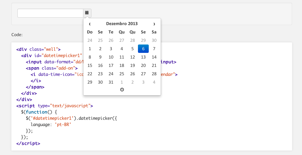
5. Bootstrap Datetime Picker

Datepicker picker to field or to any other element.

Bootstarp Date Time picker

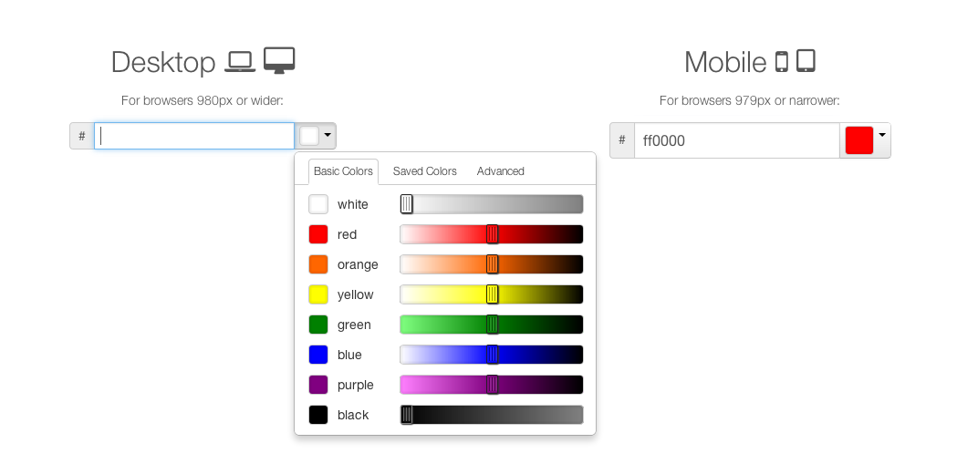
6. Colorpicker for Bootstrap

An easy-to-use jQuery color picker for Twitter Bootstrap
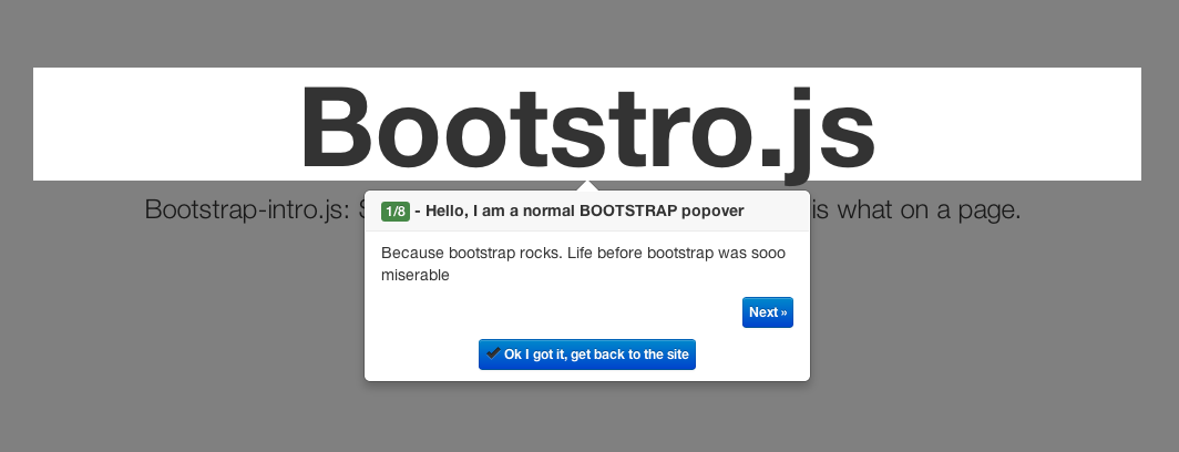
Bootstap Color Picker

7. Bootstrap Tour

Bootstro.js help you to show your users a guided tour of what is what on a page. Especially, for first-time users. Alternative for bootstro.js is Bootstrap Tour

Bootstro Guide

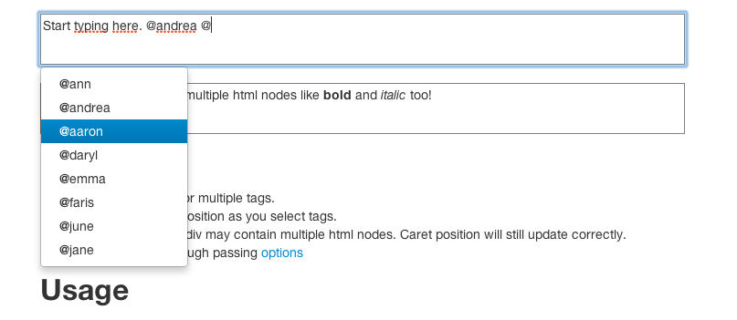
8. Bootstrap Tag Autocomplete

This is a bootstrap plugin to autocomplete tags for contenteditable div elements. It works in the same way tagging people on Facebook, Twitter or Sandglaz works.

Boostrap tag autocomplete

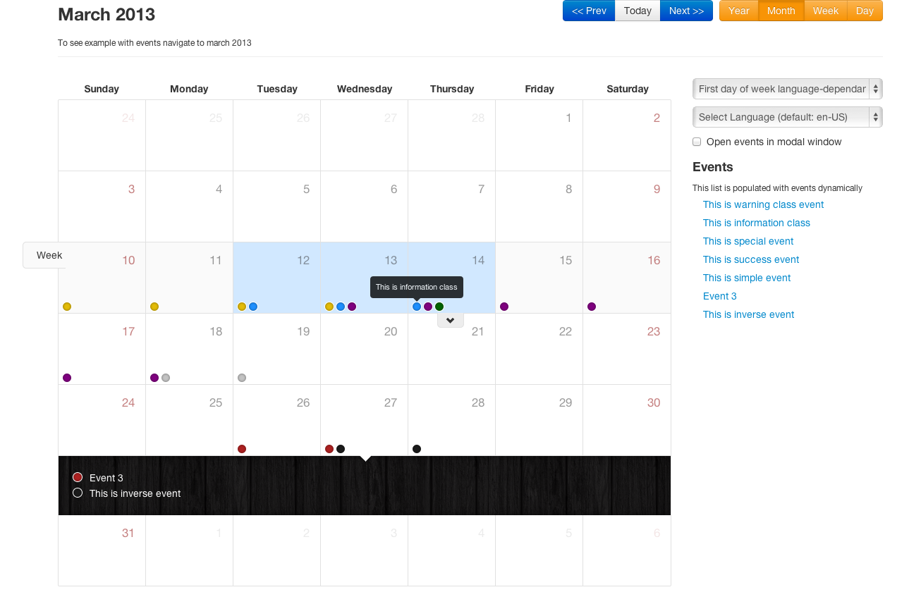
9. Bootstarp Calendar

A Full view calendar based on Twitter Bootstrap

Bootsatrp Full View Calendar

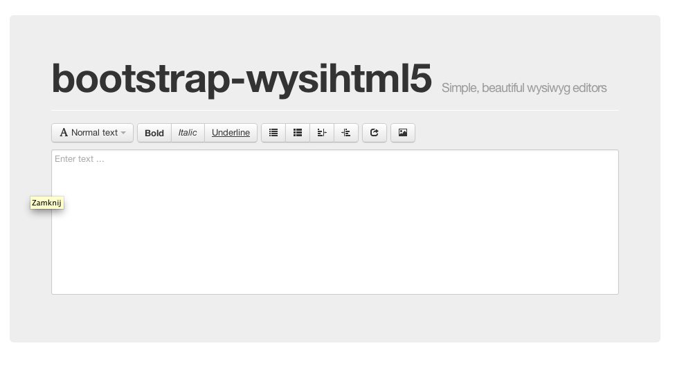
10. Bootstarp WysiWig Eidtor

bootstrap-wysihtml5 is a javascript plugin that makes it easy to create simple, beautiful wysiwyg editors with the help of wysihtml5 and Twitter Bootstrap.
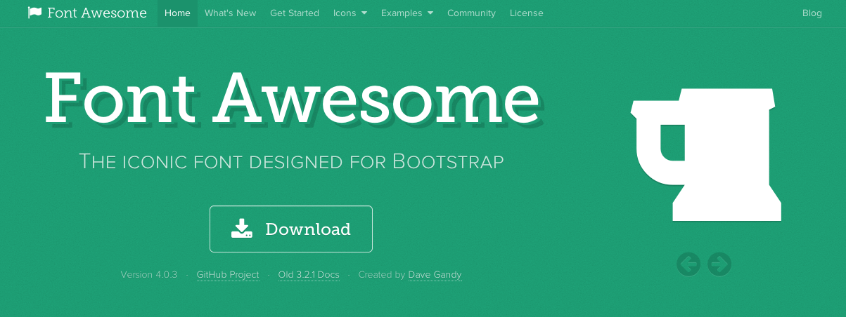
bootstarp wyswig

11. Font Awesome

Font Awesome gives you scalable vector icons that can instantly be customized — size, color, drop shadow, and anything that can be done with the power of CSS.

Font Awesome

Pocket

Want to make your site faster, especially on mobile?

Google today announced that its latest PageSpeed modules help render pages up to 2x faster, particularly on mobile devices

mod_pagespeed ngx+page_speed

As a major aspect of its mission to accelerate the Web, Google today announced the latest version of its mod_pagespeed (Apache) and ngx_pagespeed (NGINX) modules include new enhancements that improve performance. Google says it is seeing pages rendering up to 2x faster, especially on mobile devices.

This speedup comes thanks to two new PageSpeed optimizations (the first two) and existing PageSpeed optimizations (the last two:

  • prioritize_critical_css finds the CSS rules that are used to initially render your page.
  • The critical image beacon identifies the images that appear on screen when your page is first rendered and uses this to guide lazyload_images and inline_preview_images.
  • defer_javascript prevents scripts from running until the page has loaded.
  • convert_jpeg_to_webp reduces the size of images that are downloaded by webp-capable browsers.

This webpagetest video shows the results:


more informations you can find here »

How does PageSpeed speed up web-sites?

PageSpeed improves web page latency and bandwidth usage by changing the resources on that web page to implement web performance best practices. Each optimization is implemented as a custom filter in PageSpeed, which are executed when the HTTP server serves the website assets. Some filters simply alter the HTML content, and other filters change references to CSS, JavaScript, or images to point to more optimized versions.

PageSpeed implements custom optimization strategies for each type of asset referenced by the website, to make them smaller, reduce the loading time, and extend the cache lifetime of each asset. These optimizations include combining and minifying JavaScript and CSS files, inlining small resources, and others. PageSpeed also dynamically optimizes images by removing unused meta-data from each file, resizing the images to specified dimensions, and re-encoding images to be served in the most efficient format available to the user.

PageSpeed ships with a set of core filters designed to safely optimize the content of your site without affecting the look or behavior of your site. In addition, it provides a number of more advanced filters which can be turned on by the site owner to gain higher performance improvements.

PageSpeed can be deployed and customized for individual web sites, as well as being used by large hosting providers and CDNs to help their users improve performance of their sites, lower the latency of their pages, and decrease bandwidth usage.

Pocket

What is Responsive Web Design

Responsive Web design is the approach that suggests that design and development should respond to the user’s behavior and environment based on screen size, platform and orientation. The practice consists of a mix of flexible grids and layouts, images and an intelligent use of CSS media queries. As the client switches from their portable computer to ipad, iphone or any mobile device, the site might as well immediately switch and react to the client’s preferences.

Core Concepts
Three key technical features are the heart of responsive Web design:

  • Media queries and media query listeners
  • A flexible grid-based layout that uses relative sizing
  • Flexible images and media, through dynamic resizing or CSS


Responsive Web Design


Responsive Web Design tools for Developers


1. Web Designer Tools

The Google Web Designer Toos and Webflow allows you to create websites visually – you do also get access to code of course. You can create engaging, interactive HTML5-based designs and motion graphics that can run on any device

laptop-timeline


2. Frontend frameworks

Foundation / Twitter Bootstrap makes it a simple feat to create a responsive Web design framework.

Foundation


3. Responsive Design Testing

This tool has been built to help with testing your responsive websites while you design and build them.

Zrzut ekranu 2013-11-04 o 11.29.45

4. FitText

FitText makes font-sizes flexible. Use this plugin on your fluid or responsive layout to achieve scalable headlines that fill the width of a parent element.

Zrzut ekranu 2013-11-04 o 11.30.51


5. Responsive Slides

ResponsiveSlides.js is a tiny jQuery plugin that creates a responsive slider using elements inside a container.

Zrzut ekranu 2013-11-04 o 11.31.33


6. Adaptive Images

Adaptive Images detects your visitor’s screen size and automatically creates, caches, and delivers device appropriate re-scaled versions of your web page’s embeded HTML images.


7. WordPress

When it comes to maintaining a website, nothing is quite as good as having a content management system in place to handle the heavy lifting for you. WordPress allows you to set up a system to add posts and pages to a website without having to go into the code at all. The templating system WordPress uses is easy to work around for developers and designers, and if you’re really lost there are plenty of basic templates to get you started.

wordpress

Pocket
0 0 0